Friends, I’m excited to share this one with you! We literally just launched, with her beautiful logo that we already designed, brand, and website design! Dr. Lavinia Ekong came to us needing to re-brand as she felt her current brand was dated and didn’t fit her new direction. Ekong Counseling Center is more than just a place that gives therapy services, it’s sole focus is to create an environment of healing for couples, trauma survivors, and women. She felt her previous site just didn’t portray that and that’s why we created the new and improved Ekong Counseling Center below!
COLOR INSPIRATION BOARD
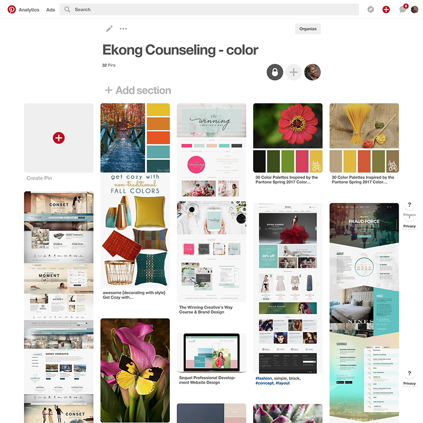
We started off with a Pinterest color inspiration board to find the new brand colors for Ekong Counseling Center. She wanted a more modern feel that would resonate with women since they are usually the person who calls to make appointments for therapy. She wasn’t excluding the fellas, it is just a fact that women call her the most.
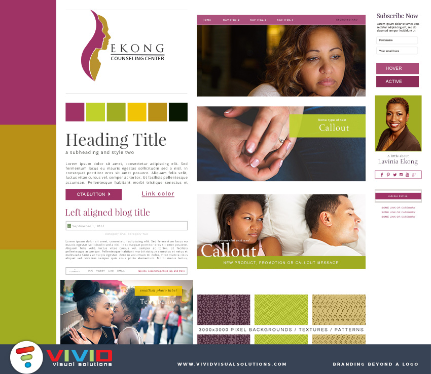
Can you tell the photo that inspired the new brand color? Yep, you’re right the photo with the lily and the yellow butterfly. Once the colors were determined. We moved on to brand board creation.
WEBSITE DESIGN
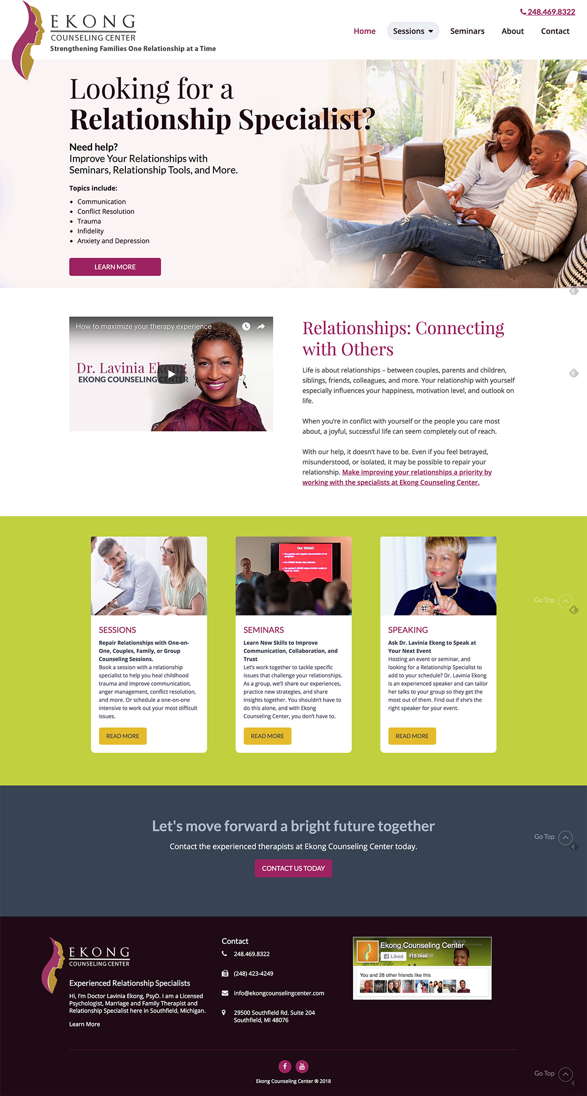
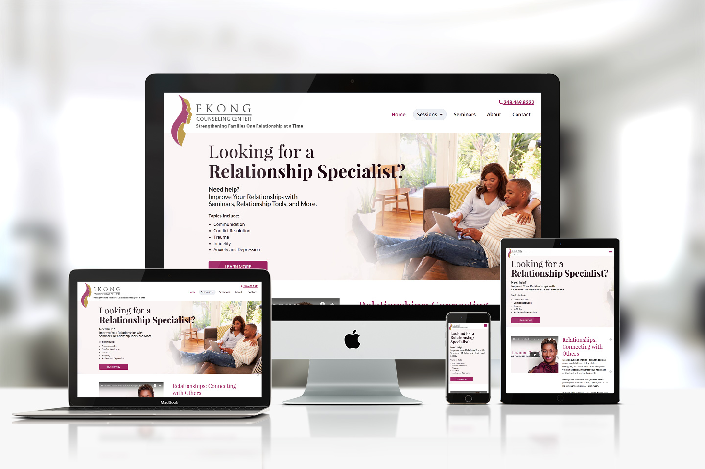
Then onto the website design, something clean, simplistic and easy to navigate. So we highlighted the header with a large photo and continued the blog below it. Overall keeping it modern, yet classic.
